Skateboarding is a strange industry. If you can put together a great team and a good video, your product will likely penetrate the market. However, you still need a killer logo that looks good on a sticker. As skaters, we identify with products that enable us to skate our best. The industry is built around that trust, and brands build an identity on being accepted by skateboarders. The logos make us smile thinking of good tricks and great times. The best ones do it for life. Here then are the 50 best skateboard logos.
All images are copyright of their respective brands, links have been provided to each brands website, if you are the owner of any of these brands and want your logo removed, please contact us (but please don’t because we think you’re awesome skateboard logo deserves to be on our list).
Table of Contents
1. Grizzly and the bear
Torrey Pudwill, Thrasher’s 2011 skater of the year, started cutting these little bears out of sheets of griptape when he was a teenager in the 2000s. Grizzly has spread out into clothing and accessories in recent years, but it remains a grip tape company at its core.
2. Enjoi’s panda bear

Enjoi is the brainchild of Marc Johnson, whose career stretches back to the halcyon days of the early 1990s. It launched the careers of Jerry Hsu and Louie Barletta. The company changed hands in the early 2000s, but that adorable panda remains enigmatic of the brand.
3. The Thunder hand grenade
Truck company Thunder began in the late 1980s as one of the first brands in the Deluxe distribution network. The Deluxe stable has grown to include Spitfire wheels, Venture trucks and Real, Anti Hero and Krooked Skateboards. The lightning bolt and heart-shaped hand grenade is their calling card, though you really can’t see either one and not think of Thunder.
4. Lakai’s check mark
Lakai took shape at the turn of the century. Buoyed by the success of Girls skateboards, founders Mike Carroll and Rick Howard launched their own shoe brand. Skater-owned and operated, Lakai is a company that commands respect. The logo sewn into the side of Lakai shoes is instantly recognizable to skateboarders around the globe.
5. Deathwish
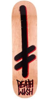
Spun off from Andrew Reynolds’ Baker brand, Deathwish grew quickly and now stands on its own two feet. It’s the home of Mike “Lizard King” Plumb and 2017 Thrasher Skater of the Year Jamie Foy, among other rippers. Using its inverted cross as the i in the script version of its Deathwish logo was a stroke of genius. It is a logo ingrained in the minds of skateboarders everywhere. Possibly even more recognisable than Baker.
6. Almost and the big red dot
Almost is an inside term in skating. As in, “Did you pull it?” “Nah… almost.” You might have landed it, but you went past the level of sketch considered acceptable. Using the broken script that is not quite straight to signify a sketchy landing, Almost lays the street cred on a little thick. It works though, and the brand owns the red dot. It’s a wormhole, but then what would one expect from the frenzied mind of mad genius Rodney Mullen?
7. Santa Cruz and the screaming hand
There was obviously a time when Santa Cruz practically owned skateboarding. It was one of the “Big 3” of 1980s skateboarding companies, along with Powell-Peralta and Vision. The other two collapsed, but Santa Cruz is still cruising, albeit mainly in the realm of longboarding. Still, the screaming hand – designed by Jim Phillips – is one iconic graphic logo that skateboarders of all generations associate with upon sight. It just – ahem – screams skateboarding.
8. Spitfire’s flame
Spitfire has been making impressively performing wheels since the late 1980s. You would be hard pressed to find a skater anywhere who has not ridden at least one set of Spitfire wheels, and most lifers return to the brand again and again. The flame logo is everywhere, but it retains its cool factor. That is the value in quality. It never dies.
9. Vans’ “Off the Wall” board logo
Vans has been ubiquitous across time is skating, but the company actually predates the invention of urethane wheels, griptape, precision skate bearings and modern trucks. It started out catering to surfers in 1966. The company’s skateboard logo graces the seam on the back of Vans’ vulcanized soles. If the words on that board were removed, skaters would still easily name the brand, but “Off the Wall” goes on that board like PB&J go on bread. Vans is undoubtedly one of the top skateboard brands.
10. Diamond Supply Co.
Founded by Nick Tershay in 1998, Diamond Supply Co. enters its third decade of existence still holding a solid grip on relevance. What started as the first real challenger to Shorty’s dominance of the skate hardware market, Diamond is now a force in the skate-fashion industry. That geometric shape is what jewelers look at before they cut the facets on a rough diamond. It is clean and simple, but the flash is undeniable, just like skateboarding when it’s done right.
11. Volcom’s stone logo
Someone always has to tell you what Volcom’s stone logo is, yet there is never an “aha” moment. It is vaguely stone-looking, but it is unquestionably Volcom. That recognition factor is as much a testament to Volcom’s success as a clothing company as it is to the longevity of the brand. The company has its hands in snowboarding as well as skating, which is a tough trick to pull off and still remain relevant in both. Volcom pulled it off though, and it continues to pump out wearable threads.
12. OBEY
OBEY is the brainchild of street artist and aging skater Shepard Fairey. Its legitimacy as a “skate brand” is in the eye of the beholder, but its roots are in urethane and concrete. Andre the Giant’s eyes were a common sight in skate parks and on streets across America for a while, and Fairey remains a force in fashion. As such, OBEY clothes can seem pricey to a skate rat, but such is the cost of art.
13. The Girl girl symbol
When Carroll, Howard, Mariano, Sheffey et al. left Plan B or their other companies to start a new skater-owned, collective-style skateboard company, it was a dicey career move. Embracing the feminine with a name like Girl may or may not have been a nod to the chance taking, as is the bathroom-door Girl symbol. History would prove these skaters had their fingers on the pulse of skating, where largely they remain.
14. Creature feature
Creature has been an on-again/off-again affair for distributor NHS Fun Factory. It started in the early 90s, then left the scene for the turn of the millennium. Like a monster from a black-and-white horror flick, NHS resurrected Creature in the early 2000s. The company has continued to build steam in the internet era thanks to killer footage from David Gravette, Ryan Reyes and more. Of course, quality boards don’t hurt, and neither does a logo that turns simple script into an instantly recognizable theme.
15. Anti Hero’s all-American Eagle
Julien Stranger was is an icon of early street skateboarding. It stands to reason that his fledgling company would rise to gain the same international recognition. As the name implies, Anti Hero is all about bucking the system. The eagle logo is a juxtaposition with the nationalism that a brand like Anti Hero has no use for. It is funny and awesome at the same time, which has been a running theme for Anti Hero since its inception.
16. Plan B
Plan B was the first super team, with riders leaving other successful board companies to skate for the new juggernaut in 1991. At one time or another, Plan B was home to more skaters of the year than any other single brand. Since its founding by H-Street guru Mike Ternasky, and through a complete rebirth in 2005, the company’s logo has been recognizable to generations of skaters.
17. Chocolate
The simple, lower-case cursive scribble of Chocolate’s logo stands out in a sea of symbols. With OG membership that included the likes of Chico Brenes, Gabriel Rodriguez and the late switch king Keenan Milton, Chocolate made its mark early and often.
18. Ripndip and the white kitty
Ripndip started out innocently in 2009 when its founder, Ryan O’Connor, started making T-shirts featuring his now-famous white cat. O’Connor passed shirts on to some friends, and the brand was born. Exclusivity breeds popularity, and soon enough everyone wanted what Ripndip was selling. The rest, as they say, is history
19. HUF
Huf is named for its founder, Keith Hufnagel, who started out with a small clothing boutique in San Francisco. Soon, HUF was producing branded hats and T-shirts, and before long Hufnagel had a full-blown clothing line on his hands. The HUF pyramid is one of a few logos the company uses that most skaters recognize on-sight. The sewn H on HUF shoes is another one.
20. Pro Tec’s Ace of Spades
Pro Tec has been protecting noggins since 1973, though it has since branched out into all types of protective skate gear. In the time when vert ruled skating, Pro Tec’s spade logo graced the pages of skate magazines more than most other products. It was everywhere. Still making trustworthy helmets, knee pads, elbow pads and more, Pro Tec has had true staying power.
21. Welcome and the cryptic conspiracy symbol
With occult imagery and a witches’ brew of board shapes, Welcome has evolved into a successful brand in the twenty-teens. It all began in 2009, with a dream of Welcome creator Jason Selaya. His indy brand came up the old fashioned way, building its rep on creativity, both of design and in the skating of its all-amateur team. Pro boards would follow, with names like Jordan Sanchez and Ryan Lay. Welcome could not have chosen a logo that better suits its theme.
22. Andale’s Mexican stereotype
Founded in 2010 by Paul Rodriguez and lesser-known pro Joey Brezinski, Andalé has quickly gained a cult following in skating. Producing quality bearings for affordable prices will do that for you, but P-Rod brings cred that hasn’t hurt the brands recognition. Neither has its tongue-in-cheek logo, an obvious nod to Rodriguez’ Hispanic roots. If you can’t beat ‘em, join em.
23. Jessup’s wings
It can be hard to imagine, but there was a time when all the skateboard parts we take for granted had to be invented. Before Jessup, people would either ride on the bare wood of a deck or glue pieces of sandpaper to their boards. The paper-backed sandpaper would melt in water, but Jessup used plastic backing on silicon carbide sandpaper to make the first standardized grip tape. Skateboarding wouldn’t be the same without it. Jessup are the original grip tape company and the Jessup wings signify the flight that its product makes possible.
24. Bronson’s Halloween scheme
No bearing company has come onto the scene with quite the thunder that Bronson Speed Co. did. Its products are high tech, and its team a who’s who of modern skateboarding. But it’s hard not to notice the slick and technical nature of its advertising. With so much put into the design of its bearings, you can’t blame Bronson for taking it there. As its name recognition has grown, so has its ownership of orange. It’ll be tough for any other company to use orange and black for its skate gear ever again. Well-played, NHS.
25. Thrasher and the Skate Goat
First of all, pick a Thrasher image and it is bound to be iconic. That said, the Skate Goat has seemingly taken on a life of its own. Irreverent to the extreme and just as likely to get you a go-to-hell look from the public as a “What’s up!” from a fellow skater, the Skate Goat is the spirit of Thrasher wrapped up in a single, antagonizing image. A true classic.
26. Independent and the Indy cross
Independent is a name in skateboarding that needs no introduction. It was the originator. All modern trucks resemble Indy’s because they have to, but Independent started it all in the 70s. The Indy cross is an image seared into the minds of skateboarders everywhere, always in black, red and white. To have remained relevant for so long without losing street cred is something not every skate company achieves, and it’s a testament to the quality of Independent’s product. Independent are one of the top skateboard truck manufacturers.
27. Lucky Bearings’ shamrock
Lucky Bearings has a couple decades worth of experience producing fast and long-lasting spinners. The four-leaf clover with “L” inset is a calling card for quality bearings that few can compete with. Sure, there is the little matter of scooters (SCOOTERS!) to answer for, but dang those bearings roll. Lucky owns the shamrock now, and that’s what a logo is supposed to do.
28. Real’s red oval
Real Skateboards dates back to 1991. Founded by OG street rats Tommy Guerrero and Jim Thiebaud, Real was one of the first companies to focus on street skating. It has been a staple in skateboarding ever since, and has been the home to great names like Dennis Busenitz, Kyle Walker, Chima Ferguson and many more over three decades. The Real oval logo dates back to the beginning, and most skaters would recognize it even were the script removed.
29. Bones’s Rat
Back when Powell-Peralta ruled the skate universe, the rat was everywhere. Obviously taggable, the sketchy rat was code for skating, pushing its popularity far beyond the wheels it represented. The wheels left the scene and have returned, but the rat bones logo never went away.
30. Element’s tree
Underworld Element was an instant hit when it formed in 1992. Those were turbulent times in the industry, though, and a reformation was required a few years later. The company’s founder, skateboarder Johnny Schillereff, drew the tree logo at that time. You know, trees come from seeds and all that. Anyway, Element has backed too many big names to list, and the tree is everywhere.
31. Toy Machine’s monster
Ed Templeton founded Toy Machine in 1992, and it has been the home to some of the most interesting skaters and graphic art that skateboarding has ever seen. The Toy Machine devil monster logo is permanently attached to skateboarding, as are the host of other characters Templeton created.
32. Bones Swiss
In the 1980s, George Powell consulted with Swiss engineers to design a new skateboard bearing. The Swiss are known for their engineering – think Swiss watches. The new precision skateboard bearings truly were smoother and faster than anything on the market. Powell used the Swiss flag as the logo for his creation, and there it remains. It is a permanent reminder of what is possible when we take skateboarding seriously. Bones bearings are essential skateboard accessories.
33. Etnies’ Arrow E
Etnies started making skate shoes for skaters by skaters in 1986. Founded by longtime Sims freestyle pro Pierre André Senizergues, it was the first skater-owned shoe company. Etnies came into its own in the 1990s, producing shoes that defined the era, and its logo was everywhere. As part of Pierre André’s Sole Technology trio of companies (including Emerica and éS), Etnies deserves its place in skateboarding history.
34. Adio in the oughts
Adio may not be anyone’s idea of a core company in the modern age, but the company had its day. In the early 2000s, Adio – founded by OG pro Chris Miller in 1999 – had one of the sickest teams in skating. With iconic footage from pros like Jeremy Wray and Kenny Anderson, Adio carved its own puffy-tongued niche. After Miller exited the company lost some of its mojo, but that wavy logo will always be attached to that singular time.
35. Primitive’s pennant
In just a few short years, Primitive has gone from one-man-show to full-on skate team. Paul Rodriguez started Primitive in 2014, carrying only Nick Tucker and Carlos Ribeiro as sponsored ams. The company has quickly earned due respect, with the too-brief “Never” video hinting at what the future holds. Expect to be seeing that pennant logo for years to come.
36. Krooked eyes
Krooked was founded by the one and only Mark Gonzales, and it’s got his fingerprints all over it. From the oddball graphics to the arthouse videos, Krooked is the Gonz. There is something unmistakable about his art – just like his skating. Those eyes in the Krooked logo scream Gonz. Krooked has been a driving force in skateboarding during this century, and with the dropping of the “Let’s Skate Dude” video, it looks like skateboarding will be feeling its influence for a long time to come.
37. Adidas’ flower stripes
Adidas has a long history in skateboarding, dating back to the early days of street skating. Back then, the stripes weren’t meant for skating, but people skated in them anyway. Adidas got officially involved in skateboarding in 2006. Many of its skate shoes are redesigns of classic models, but that doesn’t detract from the company’s relevance. The jaw-dropping Away Days video only cemented its role in modern skateboarding. While not a traditional skater owned skater owned skateboard company, adidas have proved they can produce awesome skateboard shoes.
38. Flip
Flip began as Deathbox in 1991, but by 1994 Geoff Rowley had joined as a partial owner and the brand was renamed. With classic videos like “Sorry” and “Really Sorry,” Flip gained immortal status. Those videos were really that seminal. Great names like Arto Saari, Rowley, Tom Penny, Curren Caples, Luan de Oliveira, Bastien Salabanzi, PJ Ladd and the singular Ali Boulala, the Flip name will live on in infamy for as long as there is a thing called skateboarding. Its simple iron cross logo is as much a part of lore as of history.
39. Iron Horse
Iron Horse got its start as a grip tape company, but it is better known now for its hardware. Skateboarding supplies is a tough market to maintain a grip on, but Iron Horse is proving itself a solid manufacturer. Its reputation is stellar, and its logo is slick enough to stick in the mind.
40. Venture
Venture started making low-key trucks in 1986, and it did it on the down low. There was no advertising. Every bit of success came from word of mouth. Yet, the timing was spot on. Street skating was blowing up by the time the 90s hit, and Venture was poised to make history. When the company released the Featherlite truck in 1992, everything came together. This was the first low-profile, lightweight truck meant for street skating. It solidified Venture’s place in the pantheon of skate gear that changed everything overnight. The “V” in the Venture logo can never be replicated or borrowed. Everyone else will just have to get their own letter.
41. The DC logo
Damon Way, older brother to Danny Way, formed a now-defunct but then-popular company in the early 90s called Droors Clothing with his friend and business partner Ken Block. The two chose DC as the name for their skate shoe company soon after. Get it? Droors Clothing Shoe Co.? DC Shoe Co.? Anyhow, DC would obviously come to dominate the skate shoe market for a time, and the DC logo with the little star found its way onto gear of all kinds.
42. Pig face
Pig Wheels may be holding on by a thread, but there was a moment in time when the company enjoyed the success that eludes most skateboarding startups. Its rider list was a who’s who of rippers at the turn of the 21st century, but it may have outlived its zeitgeist. Still, the image of that pig’s criminal face is a hallmark of its era.
43. Zero skull
In case you don’t know it, the bad kid in Toy Story is wearing a Zero shirt with this skull on it. Jamie Thomas better have gotten paid for that. Zero is barely hanging on in the present skate culture, but it influenced everything modern in skating. Jamie Thomas brought the gnarly back at a time when it was sorely needed. Questions of overdoing it or pushing kids to pretend muddled some of Zero’s street cred, but that is really a shame. There aren’t enough skater-owned companies.
44. Fallen’s effy logo
Another Jamie Thomas property, Fallen shuttered its doors in 2016 after more than a decade of producing some damn fine skate shoes. With larger brands coming to dominate sales, smaller brands like Fallen can become casualties. The brand is reborn, though it is without Thomas’ guiding hand and his core-skater sensibilities. Regardless, the Fallen “F” logo will remain an icon of the early decades of this century for skaters everywhere.
45. Nike and the SB swoosh
It can be debated whether the swoosh is a skateboarding symbol, but Nike earns its spot on this list by sheer force of determination. When the largest shoe company on Earth decided to muscle in on skateboarding in 2002, anything could have happened. Its riders have since come to dominate televised skateboarding competitions, and its skateboard shoes are everywhere. That swoosh symbol will forever stand for whatever Nike does with its newfound power in skating. For better or worse.
46. OJ wheels
OJ wheels have a distinct lineage all the way back to the first urethane wheels to grace the concrete. With more than four decades in an industry that caters to kids, you know the guys in Santa Cruz are doing something right. The OJs logo has always signified quality urethane.
47. Royal Trucks’ crown logo
Royal began life in 1997. It is the result of a partnership between OG Blind guys Rudy Johnson and Guy Mariano. While it may not get quite the press of Independent or even Thunder, Royal remains a core skateboard company with deep roots in street skating. Its logo with the crown is, therefore, a sign of legitimate underground credentials.
48. Is that Birdhouse “B” an upside-down “P”?
Tony Hawk started Birdhouse (you know, bird house?) in 1992. Since then, the company has experienced bouts of relevance, bookended by times of diminished status. Such is the fickle nature of catering to the whims of skateboarders. Looking at the old Birdhouse logo, it’s tough not to notice its resemblance to a certain 80s board company’s logo (hint: it’s an upside down Powell-Peralta logo.) Now the company sponsors Jaws (Aaron Homoki), so it’s probably running out of decks pretty soon. You know, cause Jaws.
49. DVS’ squiggle
DVS doesn’t stand for anything. Likewise, the swoopy logo is just a symbol, but one that evokes the early 2000s. The company was started in 1995 by pro skater Tim Gavin and friends. It has seen its ups and downs, but it continues to produce protective and poofy skate shoes, holding it down until the whole “board feel” trend dies.
50. Foundation’s moon and star
Foundation dates back to the late 80s. It was started by pro skater Tod Swank, under the World Industries umbrella. Swank soon left World and Rocco behind, though, founding distributor Tum Yeto in 1989. Tum Yeto still kicks out Toy Machine and Habitat gear, but Foundation remains in the stable. The moon and star logo may not be as relevant as it once was, but it still evokes a little shiver in the spines of a certain generation of skateboard rats.
Summary
We hope you found this free skateboard brand logo compilation interesting.
While we tried to include lots of quality skateboard brand logo pics, it would be impossible to include every awesome skateboard brand out there.
Do you like these Skateboard logo?
Did we miss one of your favourite Skateboard brands?
Do you own a skateboard company and would like your logo included?
Let us know in the comments below.


What about SoFrican?! 2018-2019 new brand logo rocks. Yin Yang waves, So’Frican is skate, snow, and surf.
World industries and rayne